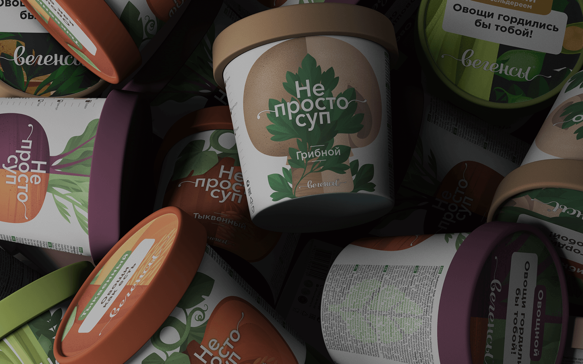
Not simple soup
EAL is boring, incomprehensible, and complicated. Unlike fruit, vegetables do not look juicy or appetizing. Looking at pumpkin, beet or carrots there is no desire to eat them. The brand's range includes both multicourse and mono soups. It's important that they look inline on the shelf. The brand is produced for many countries, so it is necessary to place a lot of technical information on a small package, so that the main image communication does not suffer.
Young mothers are trying to eat right to lose weight; entrepreneurs are trying to be more efficient; the elderly are trying to live longer. Some are willing to dive into the topic of healthy eating and different diets, while others need a ready-made tool. We conducted a study and noticed that all respondents have one thing in common: the anxiety of eating something unhealthy on a diet or falling off completely. All respondents want a simple tool and praise for doing the right thing.


In order to make the vegetables juicy, it will not be enough just to make the pictures brighter. Therefore, we decided to draw them in the style of a book illustration, and, thus, to give the package extra friendliness. The illustrations are symmetrically divided vertically, thus having the same layout, you can do both multi and mono flavors. A large amount of technical text is used as an additional surface, where by painting over the individual letters we depict the icons, thus showing the environmental friendliness of the product.